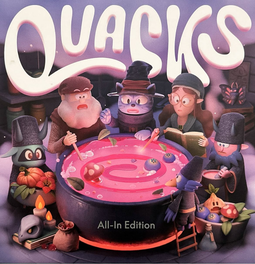
Many of you have probably spent an evening in Quedlinburg already, reaching into a bag when you know perfectly well you should stop. It is a game I have always been fond of, including its slightly peculiar artwork, so I was especially curious to see the newly updated version at the convention. The game itself has not changed, but nearly everything I was looking at had, and I found that much more interesting than I expected. Please notice, the photos are not perfect.
The new pieces were the easiest change to love. They have a wonderful weight to them, which matters in Quacks because the pieces spend so much time in your hands. Stirring them around in the bag felt good, and pulling one out had a little more substance to it. By the time our cauldrons had begun filling, I was quite convinced that this was one change I would happily bring home with me.
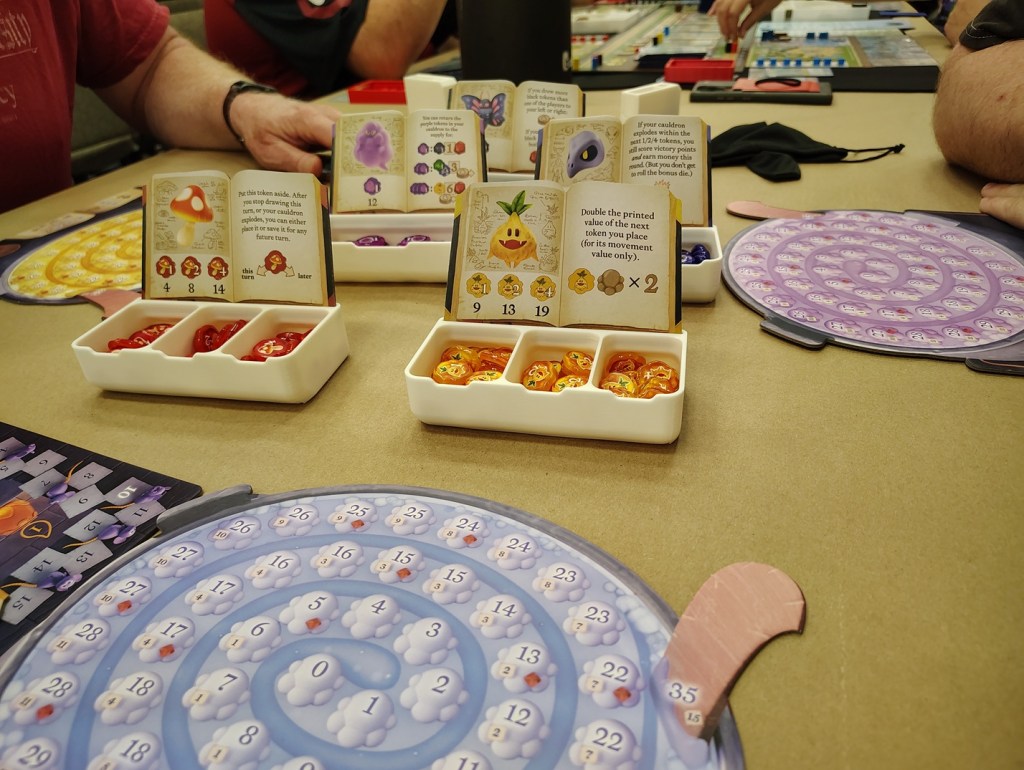
The artwork took longer. The new boards are bright and beautifully finished, and there is certainly nothing wrong with them, but I kept finding my eyes looking for the old Quedlinburg. I have always loved the slightly odd storybook quality of the original. It feels handmade and eccentric, as though these questionable potion makers might actually live somewhere just beyond the edge of the Meadow. I had never thought much about how attached I was to it until I spent an entire game looking at something else.
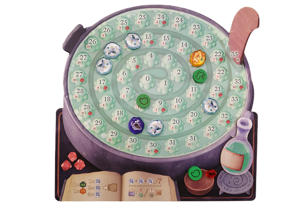
It was not just one illustration that had me thinking about the original. Quacks fills a table with artwork. There are the individual cauldrons curling around in front of each player, the ingredient books gathered nearby, the scoring board, the little flasks and all the bits and pieces that gradually become so familiar that you barely notice them anymore. Seeing them reimagined made me notice all of them again.
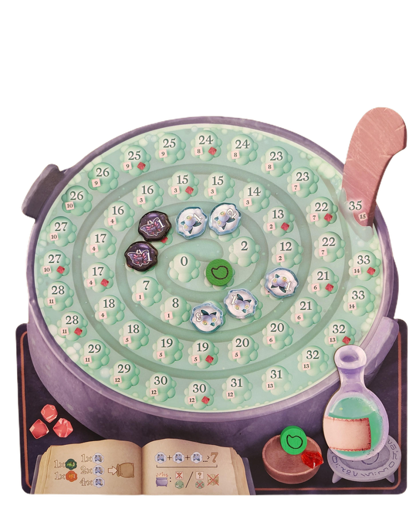
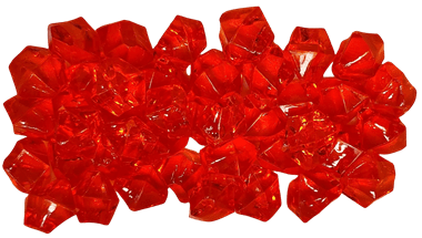
The cauldron boards especially caught my attention. They are where I spend most of a game looking, after all. Mine begins fairly empty and respectable, then gradually fills with a winding trail of ingredients and increasingly questionable decisions. The new presentation is crisp and colorful, and everything is easy to follow, but I still missed some of the personality of the old board. Apparently I have a very specific idea of what a proper cauldron in Quedlinburg ought to look like. I especially love the rubies… those stayed the same
Once we were actually playing, however, the familiar rhythm took over. Hands disappeared into bags, pieces landed in pots, and everyone began making those quiet calculations about whether there was room for one more. That is where the heavier pieces really shone. They are not something you admire once when the box opens and then forget about. You feel the difference every time you reach into the bag.
There is something wonderfully social about that part of Quacks, even though everyone has their own cauldron. I am interested in my own bag, of course, but I am also watching the pots around me grow. Someone stops surprisingly early. Someone else has far too many white pieces showing and is somehow still drawing. Another person has a beautiful collection stretching around the pot and is clearly beginning to believe they are invincible.
Then a hand goes into a bag. We all look. Some things about Quacks did not need updating.
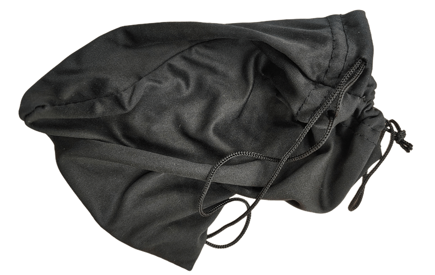
The ingredient pieces look particularly nice once several colors begin collecting in the cauldrons. Quacks has always been a busy game visually, but in a pleasant way. By the middle rounds, the table looks as though everyone has been shopping at the same peculiar little market and returned with completely different ideas about what belongs in a potion.
The ingredient books contribute quite a bit to that feeling. They sit around the table offering all those tempting possibilities for what might go into the bags next. I found myself looking at their new artwork more closely than I normally would, partly because it was new and partly because I was still conducting my quiet comparison with the old game. I did this far more often than I expected.
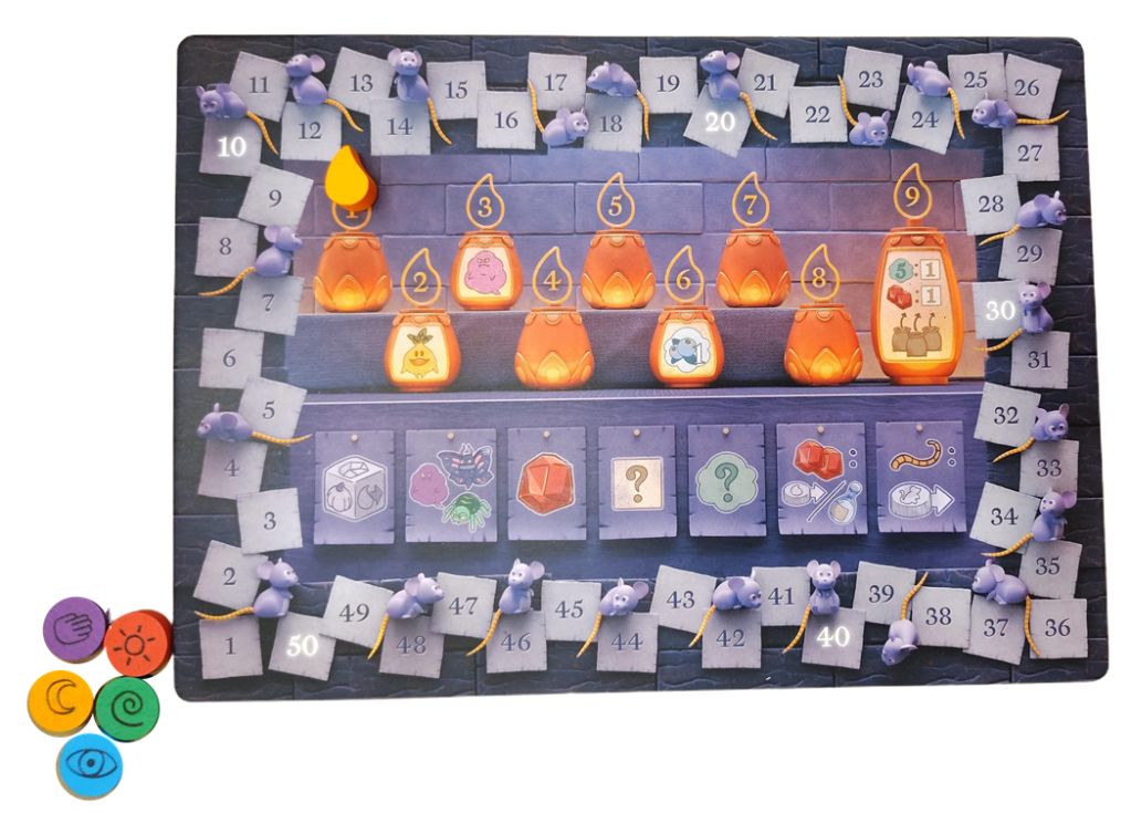
I was not sitting there disliking the new art. That would be much easier to explain. I liked quite a bit of it. The new version is colorful and polished, and seeing everything together makes for an attractive table. My problem was simply that the original Quacks artwork already has a place in my imagination, and the new version kept reminding me of that.
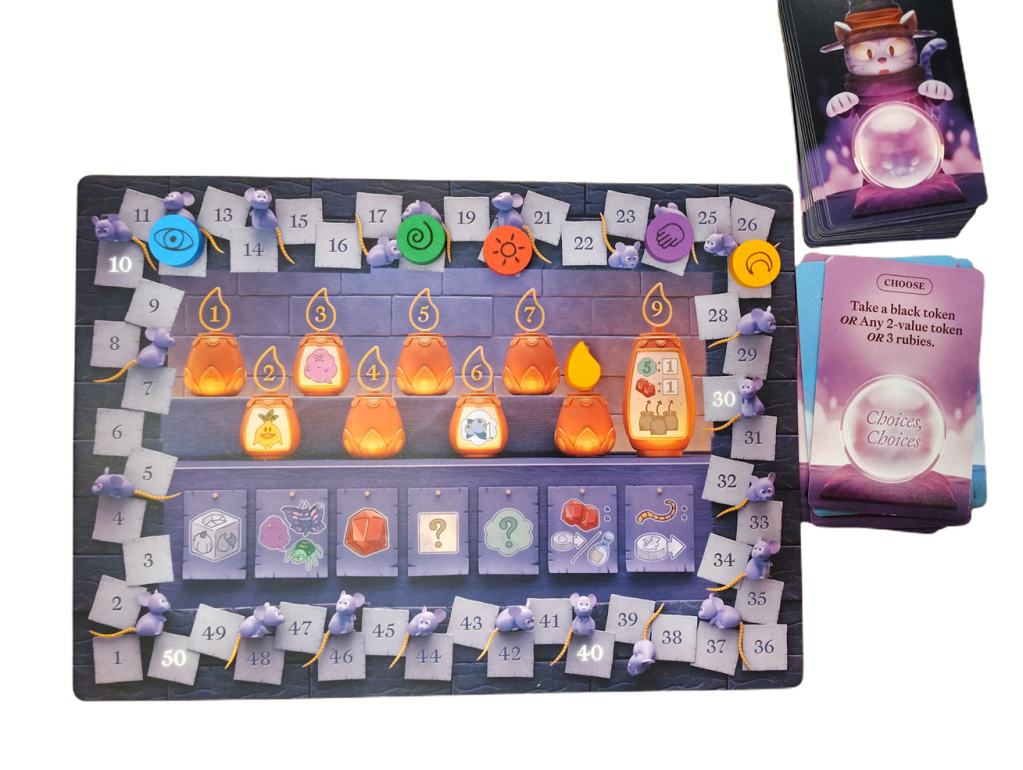
Even the scoring area felt newly noticeable. Usually the scorekeeping piece is something I move and then mostly forget until the next time I need it. Here I found myself actually looking at it. The scoring track, the markers moving around it, and all those familiar little signs of how well, or not so well, everyone was doing had become part of the redesign too.
I rather like seeing the scores travel around the board in Quacks. There is no waiting until the end to discover that someone has quietly left everyone behind. We can see where we are, and if one potion maker has wandered too far ahead, the rat tails are waiting to offer a little assistance to the rest of us. It is one of those charming pieces of the game that is easy to take for granted until a new edition makes you look at the board as though you are seeing it for the first time.
The flasks and rubies are still tucked into the experience too, those little comforts that make everything feel slightly more manageable. Quacks has always been generous about giving you just enough help to believe your next questionable decision might work. The flask can save a white piece at the right moment. A ruby can be useful later. The rats may give you a better start. Surely, with all of that going for you, reaching into the bag again is perfectly sensible.
It usually feels sensible right until it isn’t.
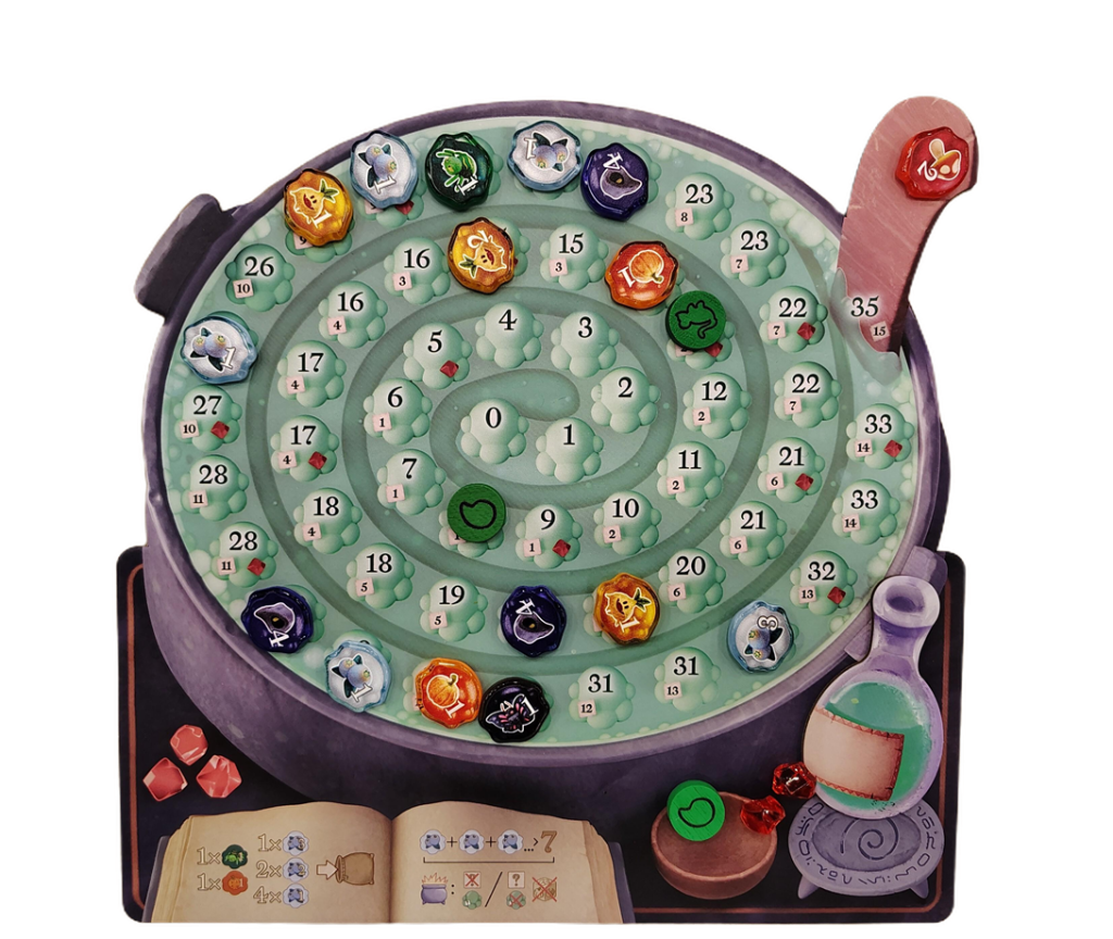
By this point in our game, I had stopped consciously evaluating every new illustration. We were laughing, buying ingredients, watching one another’s cauldrons, and doing what people do when Quacks is on the table. The redesign had faded enough that I could simply enjoy playing, which may be one of the nicest things I can say about it. Underneath the new appearance was exactly the game I wanted to find.
Then I would glance at the board and start comparing again. I could not help it.
The old artwork has warmth to it that suits the game for me. It is a little crooked, a little curious, and full of the sort of details I enjoy finding in an illustration. It feels as though it belongs to a place rather than simply decorating a game. The new artwork has its own personality, but it is not the Quedlinburg that has been living in my head all this time.
I think that was why I had such mixed feelings while still having such a good time. Nothing about the new version made me want to stop playing. Quite the opposite. The heavier pieces made one of my favorite parts of Quacks even nicer, and once our pots were busy and our bags were full, I was completely caught up in the game. Here is the other side of the board (we did not use it).
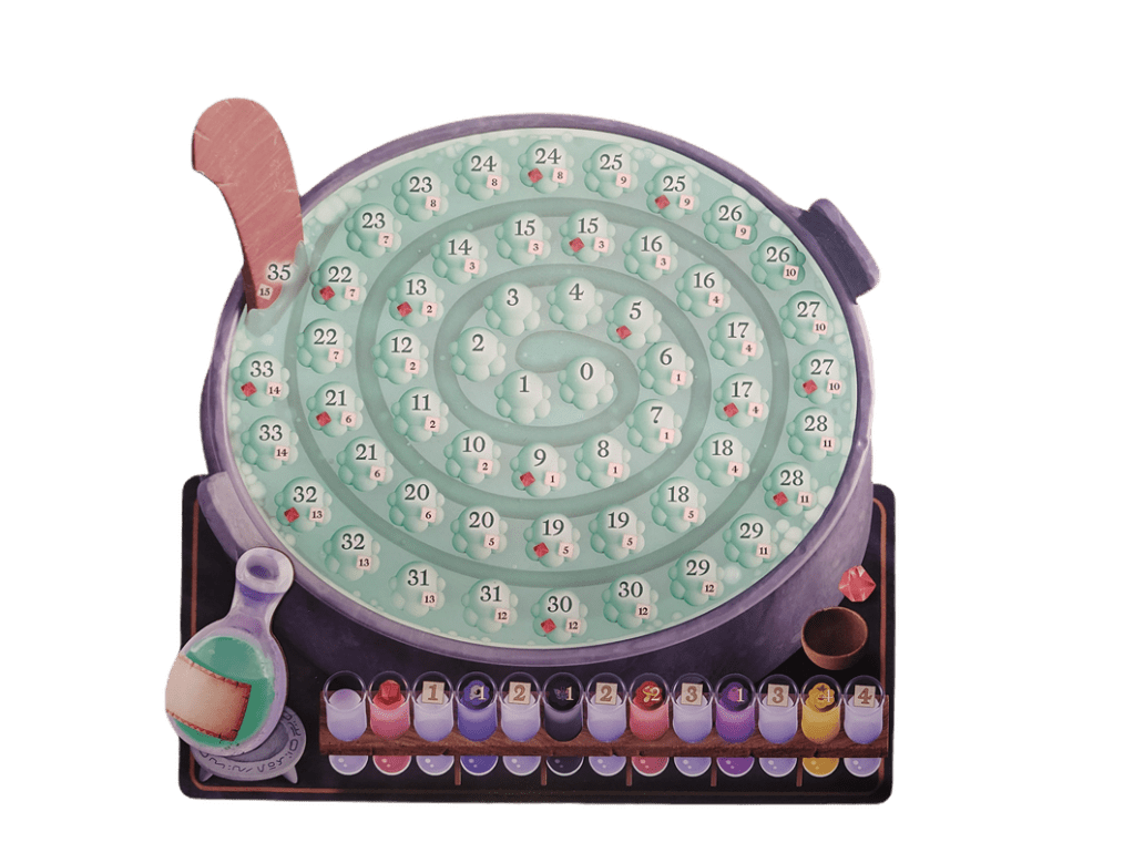
There is also something rather lovely about seeing a familiar game refreshed. Board games get worn. Bags soften. Pieces get handled hundreds of times. Boards develop tiny reminders of all the evenings they have spent on tables. A new edition gives someone discovering Quacks today a beautiful new box to open and their own version to make familiar.
I am simply not sure I am ready to trade mine.
Perhaps that is the part I did not expect when I sat down at the convention. I thought I would notice the differences, decide which version looked nicer, and move on. Instead, I discovered that some of my affection for Quacks is attached to things I had stopped consciously seeing years ago.
I remembered the old cauldrons because the new ones were in front of me. I thought about the old ingredient books because these looked different. I noticed the scorekeeping pieces because they had changed. Even while enjoying the lovely weight of the new ingredients in my hand, I was remembering what it felt like to look across the original game.
And through all of that, we played Quacks.
We pushed when we should have stopped. We watched perfectly good cauldrons become considerably less good. We bought ingredients with great plans for the next round. We moved around the score track, watched the bags improve, and reached back inside them with renewed confidence.
I had a great time.
The new edition did not convince me that the old Quacks needed replacing. Instead, it made me appreciate some things about the original that I had forgotten to appreciate, while giving me at least one thing from the new version that I would very happily steal.
Those heavier pieces really are lovely. They are thick plastic.
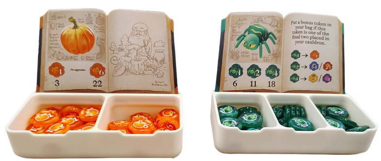
So I seem to have arrived at a thoroughly inconvenient conclusion. I want the new pieces and the old artwork. I want that wonderful weight in the bag, but I also want the slightly peculiar Quedlinburg I already know waiting for me when everything reaches the table.
Perhaps there is no need to choose. A new version does not have to make an old one less beloved, and preferring the original artwork does not make the new edition any less enjoyable. Sometimes seeing a favorite game through someone else’s new vision simply reminds you why you became fond of your own copy in the first place. The wooden tokens, stayed the same.
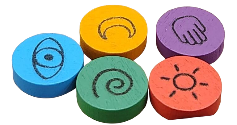
And when the bags come out, the ingredients begin rattling around, and someone decides that surely one more pull cannot possibly hurt, both versions lead us back to exactly the same place.
If you decide to purchase the new edition of Quacks, consider using our affiliate link: https://amzn.to/4giGsV0

